Keep it simple!” With shrinking attention spans, minimalist product labels have become a consumer favorite. It cuts through the noise. Clear. Simple. No fuss. Right? But not everybody likes that. With a growing emphasis on aesthetics, some brands ask, “Why stick to simple when we can do more?”
Emerging trends like storytelling labels, augmented reality integration, and unique structural designs shape how brands communicate with their audience. These innovations enable brands to tell stories, connect emotionally, and stand out on crowded shelves.
Therefore, we are looking at something new—a fusion of old combined with modern packaging. And here are 9 label design trends you should consider for your products in 2025.
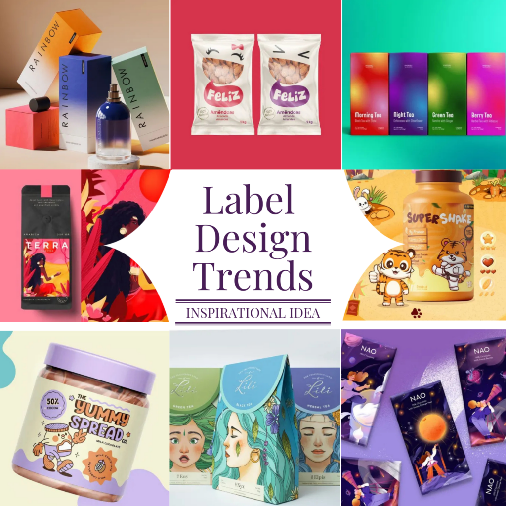
Table of Contents
60% of Product Launches Fail Due to Poor Label Design—Are You Making This Mistake?
Packaging connects the brand and buyer. If your design is poor and tacky, your product launch will likely fail. The problem? Businesses don’t spend enough time researching their designs. Having the most seductive label design on the shelves doesn’t guarantee sales if the label doesn’t connect with or resonate with consumers.
This is what happened with Tropicana. In 2009, its $35 million packaging redesign backfired as consumers found it generic & hard to spot on shelves. Sales dropped 20% ($30M) in just two months. The brand reverted to its original design, losing over $50M.
Research indicates that “for a smooth user experience, 80% of consumers expect labels that are readable and visually appealing.” So give equal attention to the audience and packaging. Run tests to find out what design labels give a more positive response.
Ready for 2025? Label Design Trends are Listed that are Making Waves
1. Transparent Labels for Product Visibility
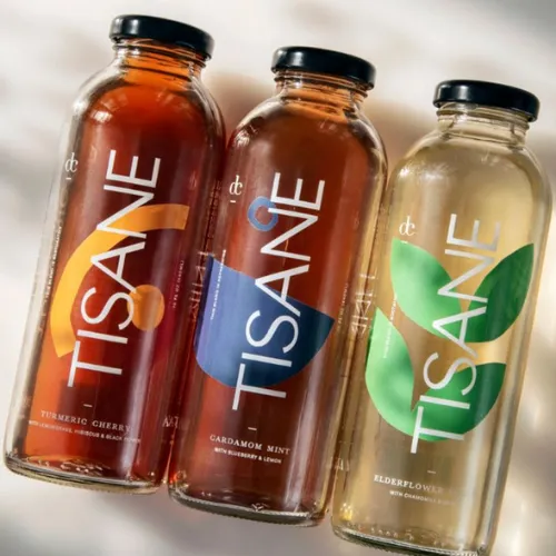
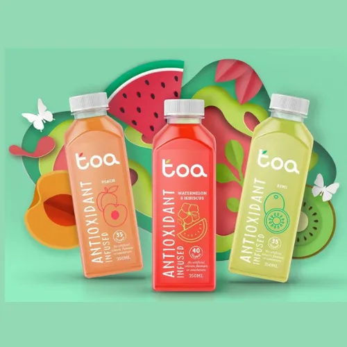
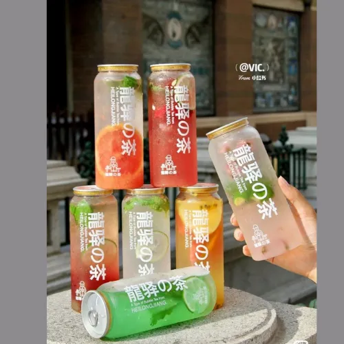
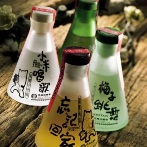
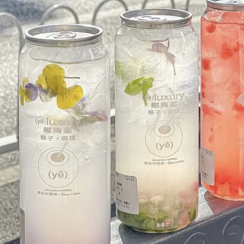
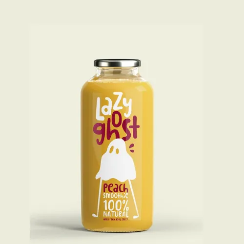
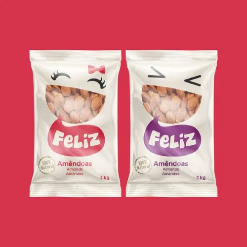
Looking for a label design trend that puts your product front and center? Transparent labels are the answer in the year 2025. These designs offer a “no-label look,” letting the product shine through with minimal distractions. They are great for industries where customers want to see the product before buying—think food, beverages, cosmetics, and personal care.
Brands that use transparent designs focus on bold graphics, thick lines, and contrasting colors. Proper application is key—clean, dry surfaces help avoid air bubbles and dirt visibility, giving a polished appearance.
Source:https://in.pinterest.com/pin/1196337398427121/
Source:https://in.pinterest.com/pin/1047157350833950298/
Source:https://in.pinterest.com/pin/2462974791759151/
Source:https://in.pinterest.com/pin/2462974791751646/
Source:https://in.pinterest.com/pin/5488830789639798/
Source:https://in.pinterest.com/pin/257479303688182324/
2. Vibrant Color Gradients
Who doesn’t love colors? They can evoke emotions and create a strong connection with your product. Blue is for trust and calmness, so it’s ideal for healthcare and tech products; red evokes passion and urgency, and brands use it for food, retail, and entertainment products; green represents growth and harmony, perfect for eco-friendly, health, and wellness products.
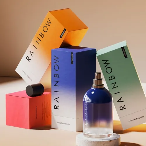
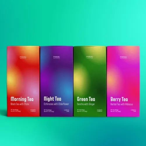
Gradients, with their smooth transitions between two or more colors, add versatility to designs. You can use them as backgrounds, overlays, and focal points. This Colour Trend will trigger the psychology of the buyer, instantly hooking them with the overall look.
When going for color gradients, the first task is to choose colors thoughtfully. Go for harmony with analogous tones. Some brands create contrast with complementary shades. Your designs should be simple and audience-focused. If you want some inspiration, look for UI/UX design, web graphics, branding, etc.
Source: https://in.pinterest.com/pin/452400725087466002/
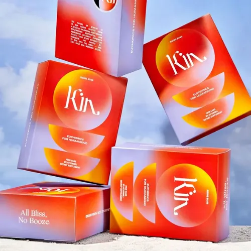
Source: https://in.pinterest.com/pin/907334656171821810/
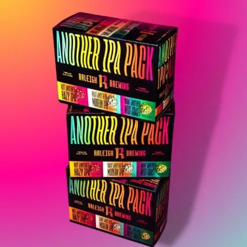
Source: https://in.pinterest.com/pin/1121959325918563920/
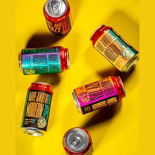
Source: https://in.pinterest.com/pin/585679126583697903/
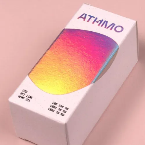
Source: https://in.pinterest.com/pin/747949450630609759/
Source: https://in.pinterest.com/pin/693976623872207990/
3. Using Illustrations As Narrative
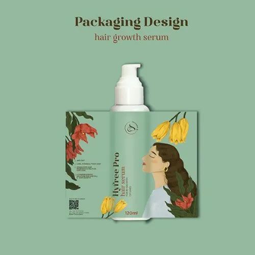
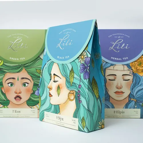
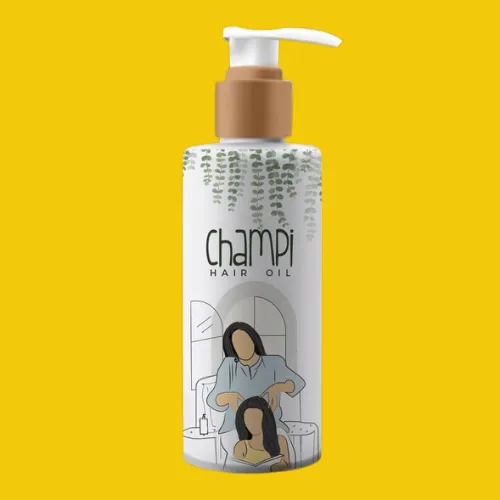
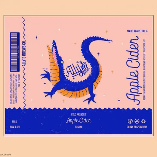
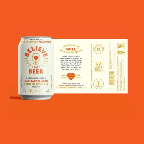
Text alone can feel dull! If you want to tell your brand’s story, turn to visual label packaging. There’s no better way. The picturesque illustration fosters higher engagement, making packaging palpable for both adults and children in 2025.
There are many ways to tell your brand’s narrative: sequential illustrations, comic-style formats, and step-by-step visuals for processes (e.g., recipes). Take the help of visual aids. Use arrows, numbers, and speech bubbles to tell the brand’s story from your lens.
Source:https://in.pinterest.com/pin/578994095874791039/
Source:https://in.pinterest.com/pin/308074430773981624/
Source:https://in.pinterest.com/pin/528328600034925333/
Source:https://in.pinterest.com/pin/659003358005646594/
Source:https://in.pinterest.com/pin/21955116923457334/
Source:https://in.pinterest.com/pin/5136987064780236/
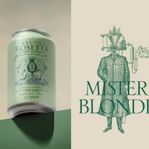
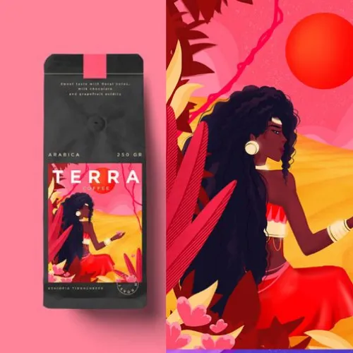
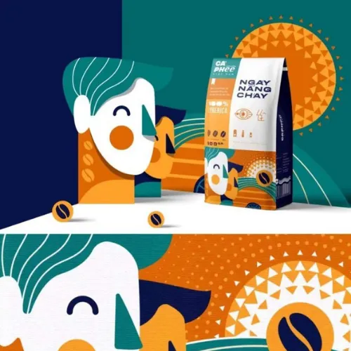
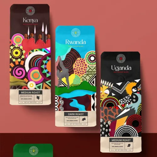
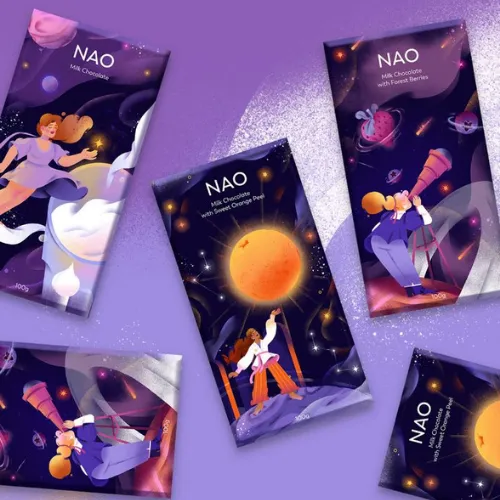
4. Cultural and Regional Influenced Design
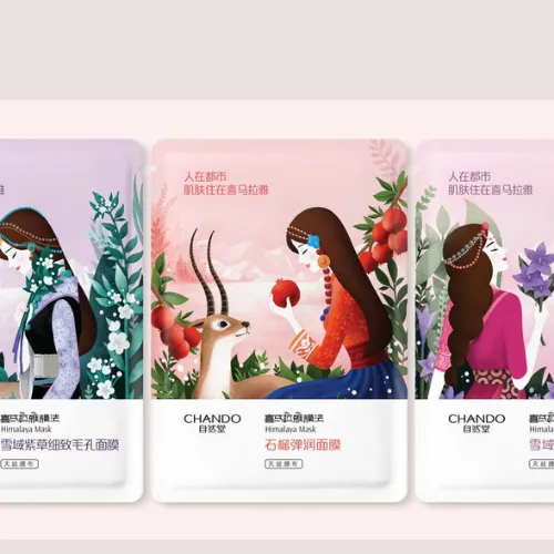
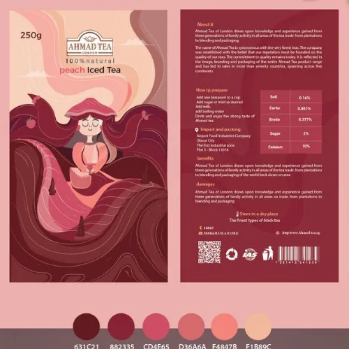
Cultural and regionally influenced design trends open a window of the world that’s unseen and unexpected. It’s new! Local traditions, materials, and aesthetics add a blend of beauty to the packaging.
If you want to target a niche market or showcase a product with a unique positioning, this labeling trend option will do the job well. Moreover, there’s room to play with. For example, graphic designers combine global trends with local styles to reach a wider audience, such as the “Japandi” style, a mix of Japanese minimalism with Scandinavian functionality.
Source:https://in.pinterest.com/pin/16114511160355019/
Source:https://in.pinterest.com/pin/90494273757110379/
Source:https://in.pinterest.com/pin/470133648614296219/
Source:https://in.pinterest.com/pin/26529085297993290/
Source:https://in.pinterest.com/pin/25684660370643658/
Source:https://in.pinterest.com/pin/1107885577055201685/
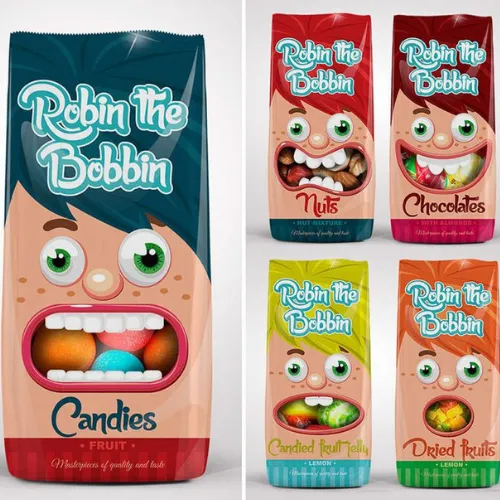
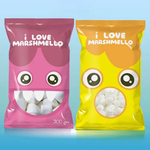
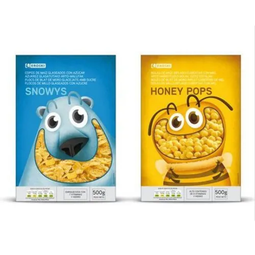
5. Mascot variations
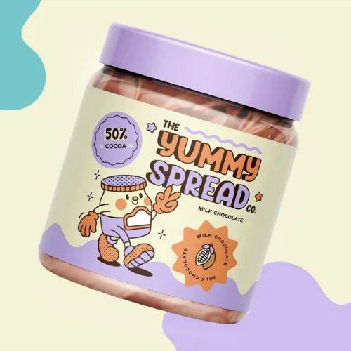
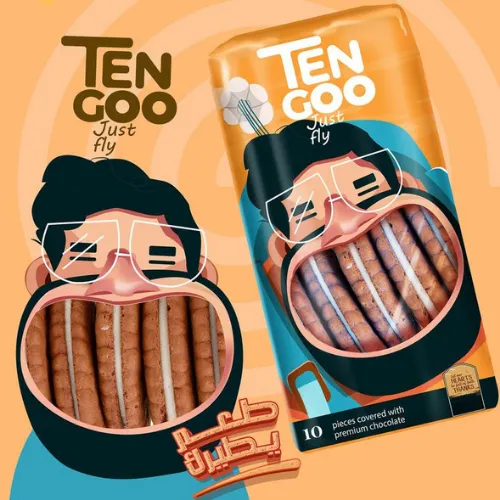
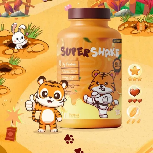
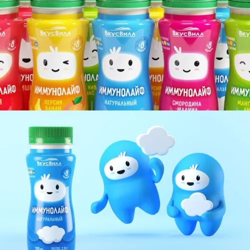
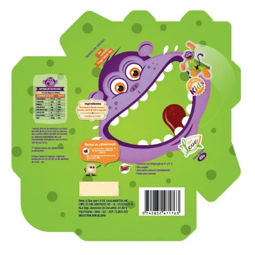
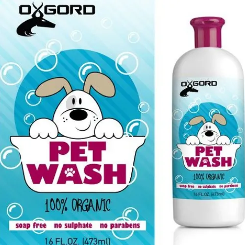
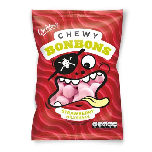
Kellogg’s, Michelin, and McDonald’s all share one thing: you can picture their brands through their mascots. Tony the Tiger, the Michelin Man, and Ronald McDonald are their iconic faces.
Why use a mascot? Mascots evolve with consumer preferences and cultural shifts. Look at the Michelin Man. He used to look sinister, but now he’s a friendly, approachable figure.
The secret to a memorable mascot will continue to be superhit in the year 2025. Pick bold colors, a strong personality, and clear emotions. Exaggerated features help with recognition and make them adaptable across different platforms.
Source: https://in.pinterest.com/pin/201676889556975367/
Source: https://in.pinterest.com/pin/302304193759641938/
Source: https://in.pinterest.com/pin/661044051592535413/
Source: https://in.pinterest.com/pin/422281208778401/
Source: https://in.pinterest.com/pin/17381148556457761/
Source: https://in.pinterest.com/pin/633811347576566106/
6. Magical Die-Cut Labels
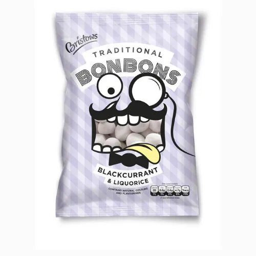
Die-cut labels are custom-shaped labels. A great thing about this trend is — you can use them on many surfaces, like bottles and packaging. Plus, they are cost-effective when made in bulk.
Use unique shapes when using die-cut labels to create a distinct brand identity. These labels are popular in packaging, promotions, and merchandise. Today, many die-cut labels include interactive features like augmented reality, offering consumers an engaging experience.
Source:https://in.pinterest.com/pin/13229392629494837/
Source:https://in.pinterest.com/pin/270497521352725914/
Source:https://in.pinterest.com/pin/128704501839318356/
Source:https://in.pinterest.com/pin/56295064083908490/
Source:https://in.pinterest.com/pin/742319951098550327/
Source:https://in.pinterest.com/pin/636555728595268545/
7. Augmented reality (AR) and QR codes
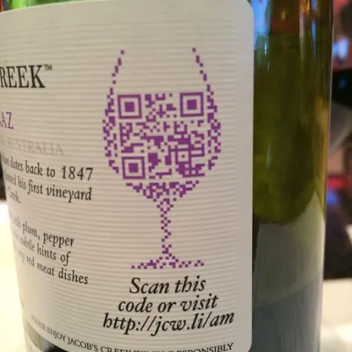
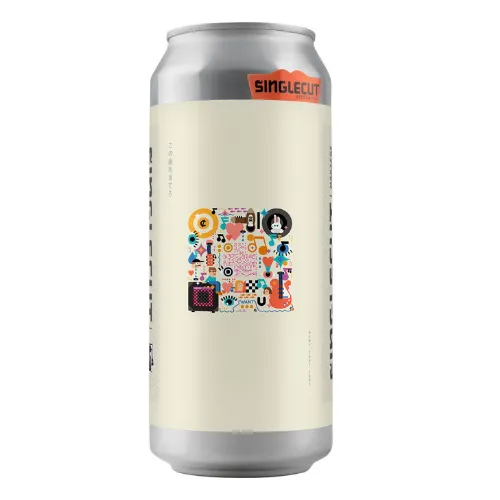
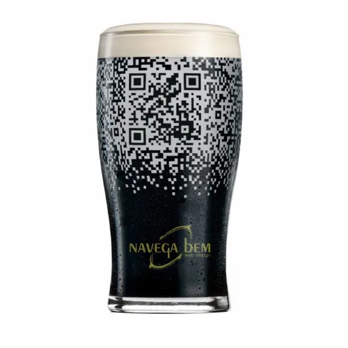
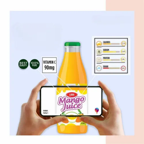
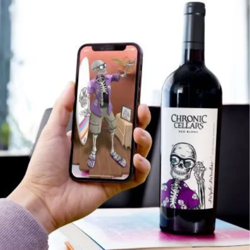
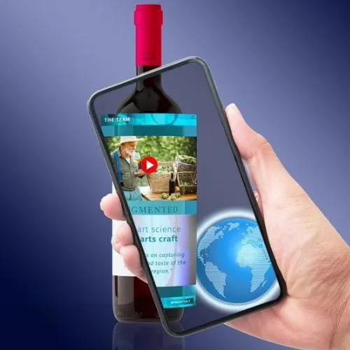
Label design trends are more than aesthetics. They can speak to the audience by connecting the physical and digital worlds. And QR codes on labels fulfill this purpose. After scanning them, users can get more information about the brand. Businesses can learn about their customer behavior and interact with customers through surveys and content.
Many brands, with the help of Augmented reality AR, take people on a virtual tour. They transform menus into virtual catalogs, artworks into stories, and labels into portals. With smartphones in nearly every pocket, putting them on to your products is a powerful marketing strategy.
Source: https://in.pinterest.com/pin/13018286419155867/
Source: https://in.pinterest.com/pin/352547477093511060/
Source: https://in.pinterest.com/pin/6685099417596118/
Source: https://in.pinterest.com/pin/1014084041090403684/
Source: https://in.pinterest.com/pin/296322850499871285/
Source: https://in.pinterest.com/pin/156359418301316944/
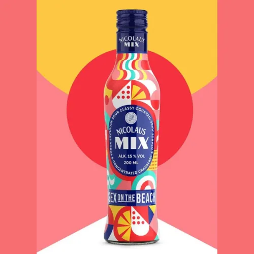
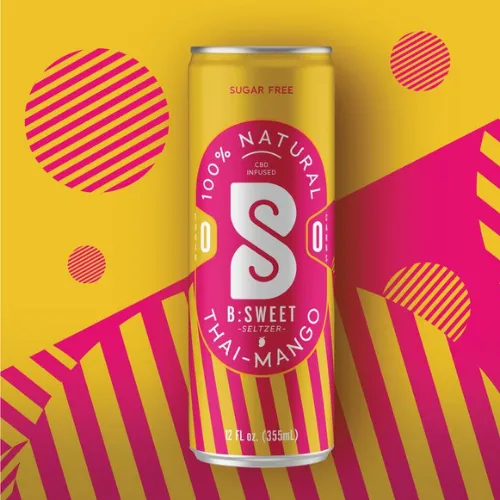
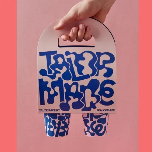
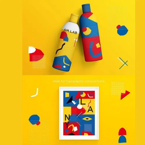
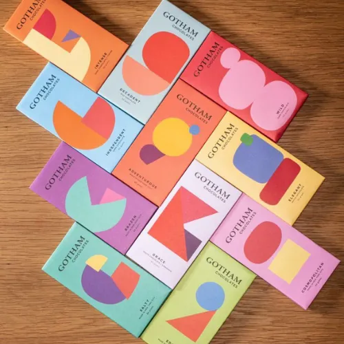
8. Geometric Patterns and Shapes
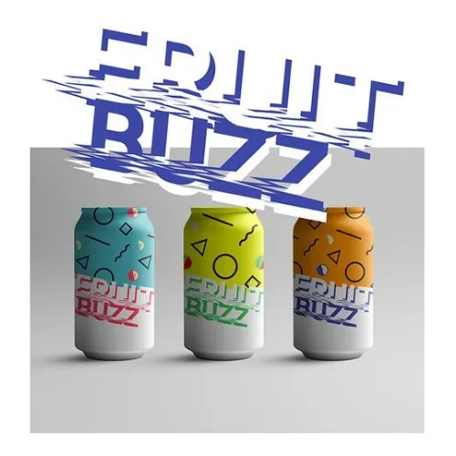
The trend of using geometric shapes to represent brands is gaining popularity. Many businesses are now packaging their products in shapes like triangles, circles, and squares. Even your local stores are stocked with 3D packages like cubes, spheres, and cylinders.
If you want to convey a strong emotion and message, geometric shapes are the way to go. Shapes have upheld cultural significance for centuries. Work with a graphic designer who understands symmetry, proportion, and pattern, so they can help you bring out the shape that represents your brand.
Source: https://in.pinterest.com/pin/3307399710707940/
Source: https://in.pinterest.com/pin/600597300326120046/
Source: https://in.pinterest.com/pin/331225747603985018/
Source: https://in.pinterest.com/pin/2533343536773730/
Source: https://in.pinterest.com/pin/891712794947221250/
Source: https://in.pinterest.com/pin/24910604184638083/
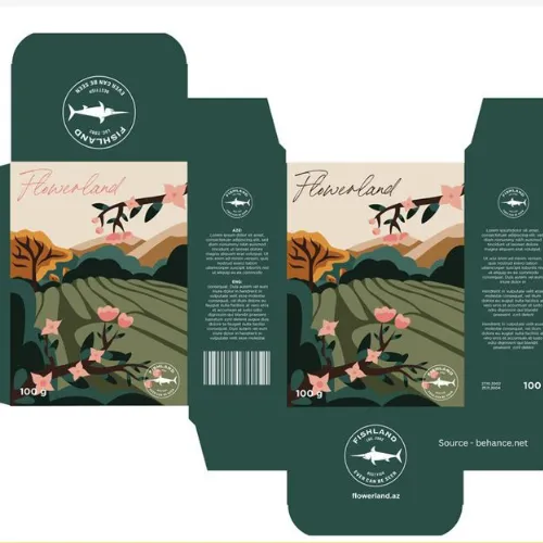
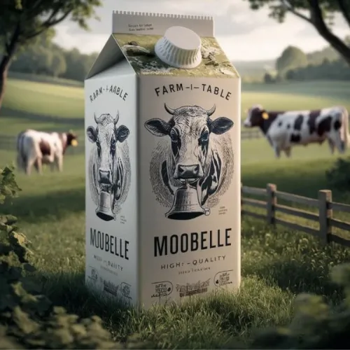
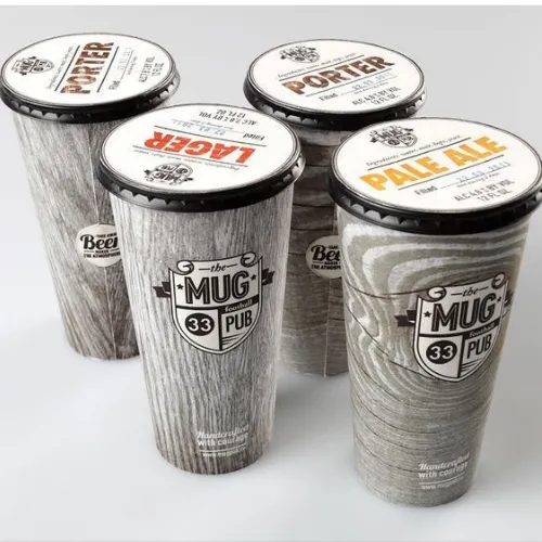
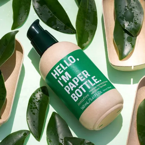
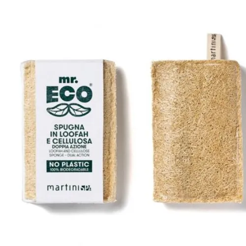
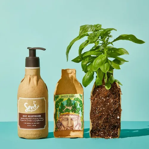
9. Eco-Friendly Materials and Sustainable Design
Sustainability has become a prerequisite across all industries—it’s just a given, not even a question anymore. Sustainable design trends include cutting waste, reducing resource use, and recyclability. Thus, choose packaging materials that are made out of bamboo, recycled steel, cork, mycelium, and hempcrete. Get certifications like Cradle to Cradle (C2C) and ISO 14062, they show you’re meeting top sustainability standards.
Source: https://in.pinterest.com/pin/501518108523127925/
Source: https://in.pinterest.com/pin/46373071157476122/
Source: https://in.pinterest.com/pin/650136896240863317/
Source: https://in.pinterest.com/pin/306174474683691274/
Source: https://in.pinterest.com/pin/571183165938535026/
Source: https://in.pinterest.com/pin/810929476698604347/
How Are Brands Getting Influenced by the Design Trends of Product Labels?
Brands are opting for contemporary trends to gather consumer engagement and brand identity. Sustainability is the top priority of brands. Recyclable or biodegradable materials appeal to environmentally conscious consumers.
Food and retail brands are going for minimalist designs, while clean typography and natural color palettes are popular in the QR codes and augmented reality (AR). Both design labels promote brand-consumer interaction, providing extra product information or immersive experiences.
Cultural influences, such as regional aesthetics, are also being incorporated to resonate with diverse audiences and strengthen brand connections.
Conclusion
Label design trends are about more than just choosing something that looks good—get it wrong, and your brand could suffer. The label design industry is seeing a shift, adapting to both simplicity and innovation to create modern, impactful designs. Classic design trends like transparent labels and mascots are as popular as they were decades ago.
Vibrant gradients, cultural influences, and AR integration are leading the way in contemporary design trends, connecting with consumers who engage with content through their smartphones. But how do you know which style to choose? It starts by understanding what your customers connect with emotionally and visually. Work with a graphic design agency to run experimentations—try out different designs, collect feedback, and adjust based on what resonates most with your target audience. Stay adaptable and check “Does your design speak to the people you’re trying to reach?
Author: Megha Malik

As a passionate entrepreneur and creative brand consultant with experience of 14 years in digital, branding and packaging industry, it is my honest effort to put my experiences and knowledge of industry towards readers. A chartered accountant by degree but a marketing personality in blood has motivated her to take in designing industry as a career. With her fun-loving personality and sharp branding skills, she is a great motivational speaker on her YouTube channel, an active member in various business channels offline as well as online. Do connect me personally via my LinkedIn and I love to share my expertise with you.
